Two facts:
1. I started using R today.
2. I can do everything I was doing in Python in R already.
That probably means I should learn R. I'm going to jot down my difficulties and successes with R here.
Super convenient for financial data. I don't know if you need the quantmod to do this, but I'm working through R basics, specifically with plotting and data types. Data types, environments I just got done with OOP approach in figure plotting with Python. R plotting seems to be more about adding layers onto a base.
- The default datatype in downloading from Yahoo Finance using the quantmod command GetSymbols() is xts (extensible time series). The interesting thing is that the dates (corresponding to the data columns) seem to serve as an index rather than an independent data column. More specifically, asking for the 0th column of a xts data matrix will print out ordered dates (R doesn't index 0 as the first entry, like Python).
I don't know whether that means the inherent dates are inaccessible as an independent set of data (and the general rule of programming I know so far is that nothing is impossible, it just ranges in difficulty). - (daily, weekly, monthly)Returns is an AWESOME function.
- The plot function weirds me out. After more time than I'd like to admit, I produced this:
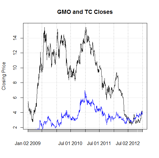
GMO is in blue, TC is in black. Haven't cracked legends yet, or effective axis labeling. The divergent spread towards the end is interesting. I think that might be the Endako mine slough, which was a problem for TC (marginal when compared to the $14 to $3 long-term decline). The x-axis is labeled poorly enough that I can only say the relative steepness of decline from 2010 to 2012 is worth looking at. Does market pressure effect development stage companies consistently less intensely than production stage companies? If I want limited mol exposure, is it worth taking development stage downside risk to have a less volatile play at mol?The short answer is that if you don't want mol volatility, you probably shouldn't be interested in mol anyway.
Back to the plot function, it works by calling a "higher-level" function that creates the plot. "Low-level" functions are used to add onto it. In the figure above, the high-level plot calls on TC stock and limits the plot based on that data. The low-level addition using the lines() function calls GMO. If the high-level plot used GMO, I would have a plot ranging from $0-6 as y-limits and TC would largely wander off the chart as the low-level addition. I haven't figured out what edits the higher-level plot yet, although the "par" function seems a likely candidate.
- The focal point on R seems to be in manipulating tabulated data. Specific entries are easily accessible along with parsing data for traits or eliminating outliers. It's simple and intuitive for that purpose.
- It feels like there's some overlap in the utility of basic functions. I'm sure there's a reason, but from the rookie perspective, it's confusing.
My logic is that if I take the time to figure out visualizations before everything else, I can see the mistakes I'm making later on. Upwards!
No comments:
Post a Comment