Monday, December 9, 2013

The Benefits of Aggressive Driving: First Result

I've included the ability to change lanes. The aggressive car checks how much room it has in front of it in the current lane. If an obstruction is present within a distance, it checks the next lane for obstructions. If none exists in the second lane, it'll change lanes and hopefully improve its situation and elapsed course time.

I ran this program 500 times with the following conditions:
1. the top speed of the aggressive car is 33% faster than the other cars.
2. the acceleration of the aggressive car is twice that of the other cars.
3. the aggressive car will change lanes to improve its situation.
4. the number of cars in the simulation are 22, which makes the density look something like this.


The differences in elapsed time between the aggressive car and a test car starting at the same speed and position are in the histogram below.

According to this simulation, an aggressive driver usually benefits from his strategy but the degree of the benefit varies substantially. By percentage, the aggressive car finishes the course on average 22% faster than the test car.

Next step is to vary the number of obstacle cars and see how that shifts the distribution.

Thursday, December 5, 2013

The Benefits of Aggressive Driving: Simulation Employing Python OOP

Two weeks ago on the way home from work, an excessively aggressive driver was dodging through traffic behind me. It was night, but like all obnoxious drivers, the headlights were of the luminous, distracting blue-white ilk. Jumping lanes, aggressive acceleration, higher top speed. At the next light, we were lined up with three or so cars in front of both of us, on a two lane road.

On the green, I accelerated gently and kept my pace at the speed of traffic. The blue-white headlight car ,jumped on the bumper of the car ahead, accelerating aggressively and quickly jumping lanes (to no advantage). At the next red light, he was only one car ahead despite his strategy.

Got me thinking. Does an aggressive driving strategy pay off on surface streets?


Using the pygame module (the Python equivalent of Java's processing), I've modeled a surface street as six stoplight objects spread at random distances apart. The function that turns the crank here is screen.get_at, which finds the RGB color scheme at a specified (x,y) location on the grid. Each car object (white rectangles) looks at its current location and ahead of it to find potential obstacles and modifies its speed to avoid crashes. 
"Stoplights" are implemented through the redzones, which slow the speed of the car. If the car reaches the end of the redzone, it stops. The green or red lines to the left of the lane indicate the light status.

The cars with the small blue rectangles are the "racing" cars. They start at the same location and speed, but have different initialization values for acceleration and max speed. At the end of the course, the time elapsed from start to finish is recorded.

The results of five simulations:
(slow left lane car, fast right lane car)
[279, 282], [257, 290], [203, 316], [208, 298], [239, 291]
how much faster?
[1% faster, 12% faster, 56% faster, 43% faster, 22% faster]

I still need to include the ability of the car to change lanes. Comparing a stupid driver with a stupid and aggressive driver isn't very interesting. 

The end questions I want to answer:
1. How much does varying traffic volume, speed differential between fast and slow cars and the length of red lights affect the course time?
2. Establish a metric that weighs the value of quickly completing the course against moderate acceleration and top speed, and find a strategy for optimizing that metric.


Here is the code. I'll clean it up later.

Tuesday, December 3, 2013

Postmortem on General Moly Speculation


I keep an eye on the molybdenum market. The newsfeed contained both "December" and "General Moly", which got me thinking about an earlier post on GMO futures expiring in December 2013.

Relevant summary:
  • General Moly (GMO) is a development stage mining company. They want to dig up molybdenum. They have the land to do so and had the money, until...
  • The financing required for mine construction fell through due to an unfortunately timed detaining of a Chinese bank chairman.
  • The stock price fell accordingly.
My assumption was that if GMO was able to secure financing elsewhere, the stock price would rebound. Futures for GMO expiring in September and December amounted to a bet on whether GMO would be able to secure financing. To date, GMO has not secured financing, and the futures expired worthless.

Mt. Hope, the focal point of GMO, has proven and probable reserves of ~1.5 billion pounds according to GMO's website (and a health dose of copper). At current prices of $10/lb, GMO is sitting on $15B in molybdenum that isn't going anywhere, for better and for worse.

Thursday, November 21, 2013

Aggregating Aggregation: "Exception Handling or: How I learned to Stop Worrying and Let R Handle Imperfections"

The code for parsing Indeed.com by keyword and area in the previous post has some primitive features. It looks for exact patterns, and based on the usual syntax of Indeed HTML, subtracts a fixed number of characters to make a usable link which I can re-paste.
I think the error I have experienced comes from this fixed number subtraction taking away/leaving a relevant/irrelevant character. It works for most links, but not all. Ideally, I would just skip the exceptions and let the loop continue through.

R does this through tryCatch(), which has a confusing documentation. Reading through this posting from the Working With Data blog helped me in writing a function that loads as many pages of Indeed as specified.


tryCatch takes your code and runs it. If an error or warning occurs, it redirects to the warning/error "handler", below the tryCatch{}. In redirecting, it doesn't stop the main loop with an error so my problem seems avoided although I don't understand what happens entirely. I ran through 5 pages of Indeed postings for analyst, and it spit out 50 instances of the expected output (as shown in the previous post).

Now I need to figure out what kind of output I want this to give, how I can speed up the execution, and automate a list of user inputs for both the keywords searched and multiple search terms, ie, "analyst","physics",... rather than the single "analyst".

but the legs are operational!

Wednesday, November 20, 2013

Aggregating Aggregation: Finding Relevant Jobs

The job hunting process is like climbing a mountain. Each time the mountain crests, you assume it is the top only to be disappointed when there is another ascent. C'est la vie. To that end, I'm trying to implement some robotic legs to do my grunt work to the next ascent.

This is a function that takes the argument that specify a search to Indeed.com, read the page, find the job links, and scrapes the third party redirect postings for relevant keywords. The non-function implementation works well but this bugs out quickly.


Example inputs as "entry level analyst"==search terms, "sacramento ca"==geographic area, 100==radius, 1==the number of pages to search. The bug appears on the fifth third party scrape, with values==defs. Debugging the function takes me to the line that scrapes the HTML but I'm still not sure where the error comes up. Obviously a work in progress, but if I can automate looking through 60 pages of Indeed.com a day, I can save myself a nice chunk of time.


Wednesday, October 23, 2013

Predictive Modeling of S.F. Crime: First Backtest

I've incorporated multiple simulations per day to produce distributions for crime volume, turning this

"X crimes will happen tomorrow according to my model" to
"X-Y crimes happen 50% of the time according to my model".

Here's a short backtest using the 150 days beginning on Jan. 1st, 2013 to illustrate what's going on. The percentile lines correspond to the 95th, 80th, 20th and 5th percentiles for each day in the simulation. The points are the realized volumes.


I've recalibrated the means used by the model to the 2003 data and ran the model forward 5 years to see how the model accounts for historical data.
A "good" performance:
1. ~60% of volumes should lie between the 20th and 80th percentile.
2. ~15% of volumes should lie in both the 5th to 20th and 80th to 95th range (~30% combined).
3. 10% should lie above and below the 95th and 5th, respectively.

What happened?
1. 50% of historical volumes were within the model-produced 20th and 60th percentiles. Low.
2. 19% were within the model-produced 5th and 20th percentile.  High.
3. 13% were within the model-produced 80th and 95th percentile. Low.
4.  ~17% were above/below forecast 95th/5th.

What does that mean?
1. As suspected, my model underestimates the frequency of abnormally high/low volume days (ie, fat-tailed events).

2. Judging from the 5th-20th and 80th-95th results, the forecasts produce higher volume days more often than lower volume days, which is inconsistent with past observations.

Now what?
The underlying issue is that my model produces volumes by combining random draws from probability distributions. Going back to Probability 101, generating a 95th percentile event will require multiple high draws from the twelve distributions. The benefit of my approach is that I can tinker with means by category (customize) without much problem and independently. The downside is that the combination of draws decreases the consistency of my forecasts with historical observation.

A way around this could be to initiate one draw which will inform the draws from each other category. Rather than combining a number of independent, individual draws to produce a volume, a  percentile could be chosen, passed to the categorical distributions and inform that choice. That would reduce the problem of combined probabilities and better account for high-volume events.
But I'm not being paid and this model is jumping into overfit territory quickly, so I won't.

Monday, October 7, 2013

Predictive Modeling of S.F. Crime: Adding Monthly Tendencies

I have been developing a model for forecasting crime volume in San Francisco, informed through publicly available historical data going back ten years. Volumes are generated through a sum of choices from normal distributions by crime category, as informed from the past data. By shifting the mean of this distribution, I have accounted for day of the week trends (Friday being a higher crime day than Tuesday) and a long-term linear decrease.

The last tweak is to account for monthly shifts. Here's a plot lacking severely in elegance to give a quick idea as to the magnitudes by year. Each year, I took the mean of the twelve months and differenced the actual number by month from the mean.


The clearest trend is that February and December reside below the mean. To include this numerically, I've taken an average of the percentage away from the mean by year. A quick example will make this more clear.

In '03, 13482 crimes were reported in January. The mean of that year was 12741. 13482-12741 ~ 740. As a percentage of the mean, 740/12741 ~5.8%. Doing this for each January, year by year, and averaging those percentages yields 3.5%. Doing this for each month, the list looks like
January ~ 3.5%        ~ 0.00115
February ~ -6.2%    ~ -0.00222
March ~ 3.6%         ~ 0.001185
April ~ -0.6%          ~ -0.000218
May ~ 1.6%             ~ 0.0000538
June ~ -3.8%            ~ -0.001285
July ~ 0.02%           ~ 0.0000711
August ~ 3.5%          ~ 0.001142
September~ 1.6%     ~ 0.000533
October ~ 5.2%        ~ 0.00167
November ~ -3.0%   ~ -0.001011
December ~ -5.6%   ~ -0.00183

As a sanity check, the sum of these should be close to zero. Taking the full, "unapproximated" values in R yields a number raised to the -17th so ~0. To include these percentages as a modifier to a daily volume forecast, I need to translate these numbers into a daily shift. This percentage does not need to be geometric like the long-term decrease because the mean is effectively being reset at each run. On an annual basis, this monthly tweak should redistribute when the crime volume occurs, but not change the total volume.

The second number trailing the percent is the daily shift that accounts for the monthly shift, by dividing the percentage by the number of days in that month and ignoring leap years.

My model is a simple conditional tweak to the means of normal distributions informed by past crimes. To put this new shift in, the past mean calculation,
Mean = Historical Mean * [ (Geometric Average Decrease)^(Number of Forecast Days) + (Day of Week Shift)]
will include a new component so that
Mean = His Mean * [(GeoAvgDec)^(NumOfDays) + (DoW Mod) + (Month of Year Mod)]

The result will be a redistribution of forecast volume which will stay consistent with annual expectations.


Above is the new method including the monthly modifier and below is the previous forecast using only a day of the week shift and a long-term shift. By inspection, it is seen that this model still does not forecast extreme events but inclusion of this new modifier has spread the distribution out rather than clustering so heavily around the downward linear trend.


The next step is to account for the fat tail events, and keeping in mind the longer term goal of putting forecasts in the context of Monte Carlo simulations.

Sunday, September 29, 2013

Predictive Modeling of S.F.P.D. Crime: Falling Short

Turning the crank in Python and R, here's my first long term forecast incorporating the tailoring detailed in the last few posts. I didn't spend much time on the plot, hence the funky axis units. The left of the red line is the actual daily volumes from 2003-2013, while after the red line is the forecast volumes. 


So far, a long-term decreasing trend and a day of the week modifier has been included. By inspection, the long-term decrease seems to be doing what it needs to because there is a clear decreasing trend. What about the day of the week modifier?

Percentile results show that the forecast volumes are lower and more tightly distributed than historical volumes. Forecasts are in italics and historical results are in regular font.

Wednesday
 Min. 1st Qu.  Median    Mean 3rd Qu.    Max. 
  202.0   339.0   372.0   377.6   414.0   666.0 
  Min. 1st Qu.  Median    Mean 3rd Qu.    Max. 
  277.0   326.2   344.0   344.7   362.0   422.0 
Thursday
Min. 1st Qu.  Median    Mean 3rd Qu.    Max. 
  197.0   352.0   379.0   382.9   413.0   576.0 
Min. 1st Qu.  Median    Mean 3rd Qu.    Max. 
    249     311     331     331     349     406 
Friday
 Min. 1st Qu.  Median    Mean 3rd Qu.    Max. 
    6.0   350.0   388.0   388.8   429.0   552.0 
 Min. 1st Qu.  Median    Mean 3rd Qu.    Max. 
  292.0   337.0   353.0   356.0   371.8   427.0 
Saturday
Min. 1st Qu.  Median    Mean 3rd Qu.    Max. 
  149.0   325.0   363.0   361.6   393.0   566.0 
Min. 1st Qu.  Median    Mean 3rd Qu.    Max. 
  272.0   316.0   334.0   335.4   355.0   394.0 
Sunday
 Min. 1st Qu.  Median    Mean 3rd Qu.    Max. 
    2.0   313.0   340.0   341.3   369.0   588.0 
Min. 1st Qu.  Median    Mean 3rd Qu.    Max. 
  237.0   291.8   308.0   309.6   326.2   376.0 
Monday
 Min. 1st Qu.  Median    Mean 3rd Qu.    Max. 
  190.0   329.0   362.0   362.6   395.0   522.0 
 Min. 1st Qu.  Median    Mean 3rd Qu.    Max. 
  256.0   298.0   317.5   318.5   338.0   395.0 
Tuesday
Min. 1st Qu.  Median    Mean 3rd Qu.    Max. 
  210.0   347.0   376.0   379.4   409.0   553.0 
 Min. 1st Qu.  Median    Mean 3rd Qu.    Max. 
  274.0   311.8   328.0   333.9   352.0   421.0 


In both cases, Friday is the peak day for historical and forecast crime while Sunday is the minimum. At first glance, the modifier looks like it has successfully shifted the daily volumes to better fit historical patterns. 

Takeaways:
  • The forecast volumes hug the mean more closely than historical volumes.
    More technically, switching from a normal distribution to a more fat tailed distribution is probably warranted. A fatter tail in the probability distribution will pull more "extreme" values more often, and so forecast volumes will spread away from the mean. When I incorporate the Monte Carlo aspect, this should lead to more accurate percentile results.
  • The mean of the forecast volumes are lower than the historical means.
    I have added a decreasing trend, so volumes would be expected to be lower. Additionally, the historical means include the last ten years of crime and so reflect the higher volumes early on in the sample. Comparing instead with a more recent set like the three year period from 2009-2012. Turning the crank on that, the means increase so something seems amiss as that is not consistent from inspection.

Thursday, September 26, 2013

Predictive Modeling of S.F.P.D. Crime: Daily and Long-Term Tailoring

My last post established that a linear model of crime volume from 2003 to 2013 has a slope of -25 (incorrectly labeled 23 in the image from the last post), and that there is variation in crime volume associated with the day of the week. This post details how I intend to include this into the model.

My approach is to shift the means of the normal distributions that I am pulling from by applying a number of modifiers, which will incorporate the specific trends I have mentioned.

As a demonstration, assume that the daily decrease in crime is ~1%, Wednesday has 5% lesscrime than a normal day and Tuesday has 5% more crime than a normal day. Tailoring the model to include these tendencies requires shifting the means of these normal distributions. As a concrete example, let's consider thefts. The mean is ~89 per day.


Through the week, the mean of the distribution selected will be changed like this:
MondayTuesdayWednesday
Mean=89Mean=89[(1-0.01)^1+(0.05)]Mean=89[(1-0.01)^2+(-0.05)]

The term inside of the brackets is the percentage modifier. The first term accounts for 1% decrease, compounding daily, hence the geometric term.  The second term accounts for the day of the week. I'll explain the origin of each later.


Long-Term Decrease:
Sequentially taking monthly percentage changes in crime volume from 2003 to 2013 produces a series of 120 "returns".The geometric mean comes to -0.212%. Bringing this to our example of an ~89 mean, day one will have 89 crimes. Day two will have 89*(1+Geometric Mean=-0.00212) = 88.81. Day three will have day two's mean, 88.81*(1+Geometric Mean = -0.00212)=88.62. This can be simplified by 89(1+GeoMean)^(Day), where "Day" is the number of the days from the start. Over a year period, the last number for Day would be 365.
The long-term decrease will be accounted for by a term of (0.997877)^(Day of Forecast).

Day of Week Modifier:
This is a lesson in documenting code. I don't remember how I got to these results, but here's what I have noted. Listed in order from Monday to Sunday, -3.3%, 0.4%, 3.5%, 0.3%, 6.6%, 0.4%, -7.8%. The numbers work, in the sense that they sum pretty close to 0 so that they will shift the distributions without affecting the totals. This is important because historical volume informs my model, and I want to stay true to that while tailoring to make forecasts account for the day of the week.
Edit:
Alright, I went back. Here's how I got those numbers.
Each year, take the number of crimes occurring on each day of the week and find the mean. For example, Monday through Friday have 100 crimes each day and Saturday, Sunday have 200 each. The mean is 128. Daily volume can be represented as a percentage above/below the mean. Saturday, Sunday are 56% above it while Monday through Friday are -21%. Summing these percentages gives zero, meaning that the predicted means overly an annual period should be consistent with historical annual means.
Daily Modifier Shift:
Monday, -0.034
Tuesday, 0.002
Wednesday, 0.033
Thursday, 0.001
Friday, 0.067
Saturday, 0.006
Sunday, -0.074


Tuesday, September 17, 2013

Predictive Modeling of S.F. Crime: Trends

So far, my model generates crime predictions through statistical applications of historical data. Calling it predictive is a stretch because it assumes a stationary, homogeneous environment for crime. Some examples are that daily forecasts do not account for day of the week volume differences or long term crime trends. I explored that a little in the data today and produced some charts to that end.

Long-Term Trends:

Monthly volume was compiled into a list. The result is the plot below, and a best fit trendline that shows crime over the last 11 years has been approximately decreasing at a rate of 23 crimes per month. Significant variance exists on a monthly basis, but there is definitely a long-term decreasing trend which could be included in a model forecasting many years out.


Day of Week Trends:

Below is a barplot that takes crime volume by day, by year from 2003 to 2013. That is, the first seven bars correspond to the number of crimes on Friday, Monday, Saturday, Sunday, Thursday, Tuesday and Wednesday occurring in 2003.


More demonstrative is to take the mean number of crimes for the days of the week in each year and calculate the distance from that mean. Let's say Friday has 1000 crimes, Monday-Thursday have 500 crimes, Saturday and Sunday have 700 crimes each. The total # is 4400 crimes in the week. The mean is 628. Put another way, 628 crimes occurring each day of the week would reach that [cough, rounding] same number (7*628 ~ 4400). The barplot below takes the distance by day from the weekly mean for each year. We see that Friday and Wednesday frequently lie above the mean, while Sunday is uniformly below the mean.


Takeaways:
1. A long-term decreasing trend would be a useful inclusion to multi-year forecasts. This trend is not strictly decreasing and deviates significantly on a monthly basis.
2. Daily differences matter. Friday has more crime and Sunday has less crime. Including this to differentiate a Friday forecast from a Sunday forecast can solve the ambiguous and interchangeable format of current forecasts.


Sunday, September 15, 2013

Predictive Modeling of S.F. Crime: Introduction

My last few posts have approached S.F. reported crime data from a descriptive perspective. My goal was to familiarize the unknown by employing data descriptively and presenting it in simple and intuitive ways. Methods keeping to this theme include:
  • natural frequencies, for example, 1 in 5 reported crimes in the Tenderloin were drug related. 
  • visualizations, such as barplots and wordclouds to compare relative magnitudes of natural frequencies and maps of San Francisco with the density of various crimes plotted over it (heatmap, of sorts).
  • brief summaries of stand-out traits in each district. The Tenderloin has the highest density of crime by area. Violent and drug-related crime are far more frequent than in other districts, and as a consequence, the arrest rate of 70% is double or triple that of the other districts.
The last few weeks I have switched focus from descriptive analysis to predictive analysis. Instead of summarizing what has happened, I want to use relevant historical data to generate forecasts for reported criminal activity.

I'm keeping it simple to start. I organized the data into daily cuts. From there, the crime/day was calculated for high volume crimes individually (crimes occurring more than 2500 times a year such as theft, robbery, burglary, assault, missing persons, non-criminal, other offenses, drugs, warrants, vehicle thefts) and for low volume crimes combined.

The data set of 223 days allows for a histogram of 223 individual values. For the high volume crimes (mean of more than ten a day), their distribution looks normal for a first run approximation. One such example:


 Approximating each high volume crime and the grouped together low volume crimes with a normal distribution gives a mean and standard deviation. A daily crime volume forecast can be produced by pulling randomly from each distribution, giving a # of each crime/day. Summing these, a daily volume is produced. Repeating this process 365 times yields the following barplot. The red line is the annual mean and the blue lines show a standard deviation on either side of the mean.


This is a first run and has little utility for decision making. There is no accounting for daily, monthly or annual trends, such as higher crime volume on Friday. It does not distribute crime by police district, which would be relevant to staffing. More importantly, each day is a random selection from a normal distribution. Another annual generation would likely not resemble this one in anything but the mean and variance.

Where can this be improved?
The short answer is everywhere. The main inclusion needed is realizing daily forecasts in the context of Monte Carlo simulations. With many daily forecasts, I can replace a one number estimate with percentiles. As an example, my day one crime volume was 339. If I ran my annual simulation 1000 times, I could instead offer an estimate through percentiles such as, "95% of outcomes fell below 400 crimes/day". 
This still does not improve the model, except in improving the clarity of results. To make this model useful, I need to include how these crimes are distributed by hourly blocks and police districts. Further, pulling from a stationary mean and variance make this a time independent model. While that might be the best approximation, I am not well enough informed to make that assumption. Finally, long-term or daily trends can be included on further studying the data.

Tuesday, September 3, 2013

SFPD Project, Part 2 by name and not proportion

Here's a wordcloud that pulls from the descriptions of the 75k+ crimes reported in San Francisco so far. The larger the word, the higher frequency it is mentioned. Theft 

The quick conclusion is that the largest problem, by frequency, has to do with theft from autos or property. Of the 20k larceny/theft reported, only 1.2k had any sort of resolution. Reinforcing that notion is the incidence per 1000 crimes of each category. Larceny/theft is always the largest proportion of crime,


with the exception of the Tenderloin,


where drugs are a contender for most frequently occurring crime. An incredible 1 of 5 reported crimes involve drugs in the Tenderloin. For context, the average is 1 of 20 in the other 9 districts. Parsing for drug descriptions across the city showed that the occurrence of type of drug is fairly equal (don't quote me because that is off memory of something I ran a few weeks ago), but in the Tenderloin it was significant leaning towards "harder" drugs (non-marijuana, that is). Not surprisingly, the frequency of assaults and other non-theft crimes increases in the Tenderloin. Come to think of it, jacking people in the ghetto doesn't make a ton of sense. 
The other exception is Bayview, where nobody drives with a license plate (ie, Other Offenses). Also not a wonderful area, in terms of % of violent crime.


Here's the last chart I liked. Pretty self-explanatory. The Tenderloin has an abnormally high percentage of arrests. That comes with the drugs. An anecdote from the incoming PD officer this research was intended for went along the line of that the officers from the TLoin station walk out into the street, and before they even get into the cars they have to arrest someone. 


If exciting to you meanst putting the bad guys away, assaults (40% arrested), drugs (90% arrested) and warrants (93% arrested) are the ticket. The Loin, Mission are the heavy hitters in that department, followed by Bayview, Northern and Southern. It looks like Richmond, Park, Taraval and to a lesser extent, Central, are going to involve driving around and listening to people bitch about what was stolen from them and vague descriptions who might have done it when you know you will never actually find the person who did it. But there won't be as many crackheads, so they have that going for them.

Also funny is how the hood has a disproportionately low amount of burglaries compared to the rest of the crime occurring. Park, Richmond and Taraval lead the way at about 7-8 %. Can't blame the burglars for stupidity, anyway. Worth reinforcing that since this is a frequency of occurence rather than raw buglarly numbers, those districts haven't had the most burglaries (Northern and Southern are ahead, but not by as much as might be guessed without the numbers) because more crimes are committed elsewhere. Anyway, burglars know where to shop.


Monday, August 26, 2013

SFPD Project

SFPD has publicly available data on all reported crime including descriptions/location/time/etc. I've spent the last few weeks parsing it and trying to package it in useful ways to an incoming PD officer. Here's a few plots.


Monday, August 12, 2013

American Rhetoric Wordcloud

I found a list of 100 great speeches in American history and made a wordcloud using the R package of the same name and some Python to parse the texts with a code snippet I already had. After taking out some of the expected words like "the", "if", "when", ..., this is the result.


For context, "people" and "progress" were mentioned 554 and 52 times respectively.  Political shows 5 or 6 times. That could be a quirk with the wordcloud package, or, more likely, something wrong with how I put together the data in R.
Takeaways?

  • There's a focus on who is involved or affected rather than the what affects them: "people", "human", "man",, "children", "nations", "public", "country", "american", "world", "men" all are big players. What's like "Political", "economic", "security", "policy", "independence", "forces", "freedom", "progress" are all listed but with less frequency. An alternative explanation is that more synonyms exist for the "what" words rather than the "who" words.
  • Interesting enough, "war" and "peace" occupy similar areas. "War" appears 310 times with "peace" behind at around 240.
  • A few of the speeches belong to Martin Luther King and so "black" made the list of 50+ occurrences, at 62. Unfortunately, two words were left out of the plot due to sizing issues. "Black" was one of them. I thought we were past this, R.
  • I wouldn't have imagined temporal diction to play so heavily. "Years", "today", "before", "time", "now", "present", "history" are some examples. A call-to-action is common advice for public speaking, but I imagine that just as important in these speeches would be putting historical weight behind claims. "For years, we blah blah blah" makes a journey out of social change or societal innovations, while "We blah blah blah" does not sound as legitimate and important.


I want to compare American rhetoric against historically evil contenders in the Hitlers and Stalins of the world, just to see what/how much overlaps, but this is enjoyable enough to warrant its own post.

Saturday, July 27, 2013

US Paper Towel Waste: How Many Do We Use?

In the previous post, I've justified a range of 13-15 billion pounds of paper towels used in 2012. Smith's talk aimed at making people conscious of proper paper towel usage, which should make one towel sufficient for the purposes of drying hands. More than one would be waste. Joe Smith's TED talk claims that using one less towel per day per person will save over 571,230,000 pounds of paper per year. That was in March 2012. 

The population in March 2012 was 313,152,958. One paper towel for each person in the U.S. each day for a year is 114,300,829,670 towels. That implies a weight per towel used by Smith of 0.005 pounds, or about 2 grams (2 paperclips). RISI estimates that 2/3 of tissue consumption is at home while 1/3 is in commercial use. I assume overuse is most prominent in the commercial context. 1/3 of the 13-15 billion pounds is 4.3-5 billion pounds of paper towels used commercially. 

I'd think that the amount of towels pulled from a dispenser is something like a log-normal distribution in a commercial context. In my experience, I don't often see a person use one paper towel or one napkin at the table and so I'd put the peak at 2 per use. I'll split the probabilities arbitrarily, on my own guess, up like this:
20% - 1 towel
45% - 2 towels
30% - 3 towels
10% - 4 towels
5% - 5 towels

That would put around a billion pounds of commercial paper towels (or 200 billion individual towels) as used properly, and the remaining 3.3-4 billion pounds (or 660-800 billion individual towels) as waste. Saving one towel per day per person such as Smith did is a wise thing to estimate because it deals in mostly concrete values and not on your own idiotic and unfounded estimates, but detailing the context to orders of magnitude starts to illuminate the waste of what can be saved.


US Paper Towel Waste: Where do Joe Smiths numbers come from?

In the previous post, I started coming up with figures on US paper towel usage with the end-goal of finding where the numbers used in Joe Smith's TED talk came from. His claim is that 13 billion pounds of paper towels are used in the U.S. each year. My best from Googling gave me a number of around 7 billion, so notably far off and needs straightening out. I'll do that here.

 The RISI estimate for 2012 tissue usage in North America (a blanket term including the different forms of towel and tissue) was around 18 billion pounds, so Joe Smith's number includes about 70% of the total tissue usage in 2012. Working off a 2008 report by RISI,
The North American tissue market is comprised of toilet tissue (45% share of North American consumption), toweling (36%), napkins (12%), facial tissue (6%) and other uses, including sanitary (1%).
 it seems reasonable that he is assuming the lions share of the toweling and toilet tissue market, ie, 45+36= 81%, which gives ~15 billion pounds. Smith's talk was given in 2012, so I'd assume he is using 2011 numbers instead of 2012 numbers. Organic growth could account for some of the discrepancy. A growth from 13 billion to 15 billion year-over-year is a 15% growth, which is too much growth to be reasonable as solely accountable. My guess is that the discrepancy lies in the percentage breakdown of tissue use. My numbers are from 2008, while his could be from more current years. For example, if the 45% toilet tissue and 36% toweling percentages (totaling 81%) changed to 43% and 34% (totaling 77%), 15 billion pounds drops to 14 billion pounds.

I'll assume that a combination of organic growth within the tissue market and shifts in end-use percentages close that gap and the 15 billion pounds in 2012 is probably more like 13-15 billion pounds of "paper towels" used in 2012.

Friday, July 26, 2013

U.S. Paper Towel Waste: Testing the Bounds of Google Search

There's a TED talk by Joe Smith about using paper towels properly. He claims some numbers on paper towel usage and waste. I'm going to see if I can get something close with Google and estimations. It'll go something like this

1. How much do we consume per year (for comparison against his number)?
2. How much of that is unnecessary use?

Now for getting some estimates for these values. Digging around the internet, you'll find things like this dug from netdryers.com:
According to Tissue World magazine’s April/May 2012 edition,
 the US Tissue Market is a $16B market of which 37% is AFH (Away From Home).

Tissue World magazine. 'Nuff said.

I'm taking a crack at (2) first. Fortunately, consultants exist. RISI, an information provider for the foresting industry, produced this chart:
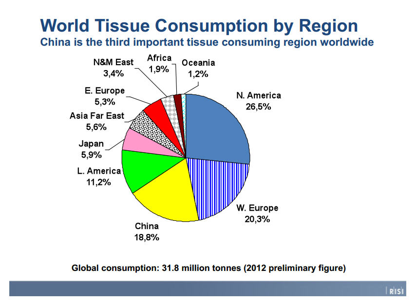
RISI, through this chart, claims that North America uses 26.5% of 31.8 million tonnes, or ~70 billion pounds of tissue per year. North America tissue use is then 18.58 billion pounds. Tissues is a broad category that includes bathroom tissue, hand tissues, paper towels, sanitary towels and so on. A report from RISI exists free of charge on the internet (probably because it's from 2008 and we all know the paper towel industry is cutthroat and if you don't keep current with supply/demand statistics, you'll get wiped up by the competition), and claims that in 2008, 36% of the tissue market consists of "toweling", which I assume is the category I'm looking for. Perhaps the most obscure Googling I've ever done followed: historical toweling consumption,


which gives results about what would be expected. I have work in a few hours so I'm going to be lazy and assume that there isn't much shift in end-use percentages of tissues from 2008-2013 in the US. I would worry about this if the developing world was involved because I'd assume as per capita wealth in the developing world and namely China increases, the percentage of paper towels used would increase since paper towels feel like the most discretionary version of tissue that I use.

So, we have total US tissue consumption in 2012 and an estimate for how much of that consumption is in towels. 36% of 18.58 billion pounds is 6.689 billion pounds of tissue used per year.

I'm wiped out and you've absorbed all you can about paper towels today, even if I've quilted the readily ply-able information elegantly (which I haven't).

Next step is to haggle with the severity of all you peoples waste.

Monday, July 8, 2013

Annual Mol and Copper Prices, 1900-2011 and the '79 Spike

Courtesy USGS,

The focus here is '79. The cause of the price spike was the Iranian Revolution causing a oil shortage. The response was to expand oil production elsewhere through building new wells, which need molybdenum. Molybdenum demand spikes. On the supply side, the Endako mine went on strike. As with the 2000's spike, the inability to quickly raise production to meet demand is the catalyst for sharp price increases.
Not the most elegant plot, but the level of production increase around '79 is clearly comparable or less than many other years from 1960-1990. Higher resolution data would be nice but annual is all that is available. I doubt in 1920 monthly molybdenum price data was not a key concern.

Saturday, July 6, 2013

Metals Basket: Value of $1 through time

Playing around a bit more with the daily metals data from Quandl. Does molybdenum move with the crowd?

Investing in any of these metals, at best, gives you your buck back. Molybdenum looks like it plays by its own rules and has had a period of less volatility than others in the metals basket, although the graph is a bit noisy. One part of the heteroskedastic, anyway.

Next, try to find long term data (back to early 2000's, or even 90's) of other metals to match with my set of monthly molybdenum returns from '93 to 2013 to incorporate both volatile (94ish, 2004-10) and stationary periods.

Tuesday, July 2, 2013

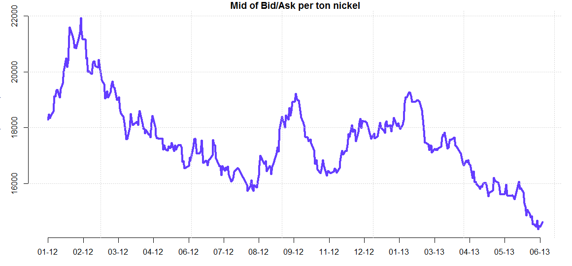
Metals Basket, 2012-2013 Mids of Bid/Ask Spread

Quandl has a variety of metal bid/asks. I'm not sure how to massage data with missing elements into the same plot so I've done them separately. It would be worth fixing the plots so that the scales match because the apparent volatility from plot to plot is not comparable and could be deceptive on little examination. 


Some variation, but largely following the same trends. Would be useful to make a rolling average for each plot and put them on the same plot to cut the noise down. Now here's molybdenum:


Point being, molybdenum plays by its own rules. It's unfortunate that (free) molybdenum data only exists at the start of 2012, although Quandl adds onto the series daily.

 Next, stack rolling averages and look for divergences within the group.